ECO COLLECTIVE
UX DESIGNMy UX team researched, prototyped, tested, and validated an idea for a brand-new mobile application: Eco Collective. This app serves to make recycling and being eco-conscious more accessible.

Challenge: Design mobile app (mid-fidelity)
Role: Project Manager, Prototyping
Duration: 3 weeks
Tools: Adobe XD, Miro, Photoshop, Invision
Research
To determine the goals and direction of our app, we created a qualitative survey and received 70 completions. Next we conducted 5 user interviews and a competitor analysis.
Our main research finding was that users not being able to recycle all of their items is a common frustration and not knowing where to go deepens that frustration.
Our main research finding was that users not being able to recycle all of their items is a common frustration and not knowing where to go deepens that frustration.
Persona
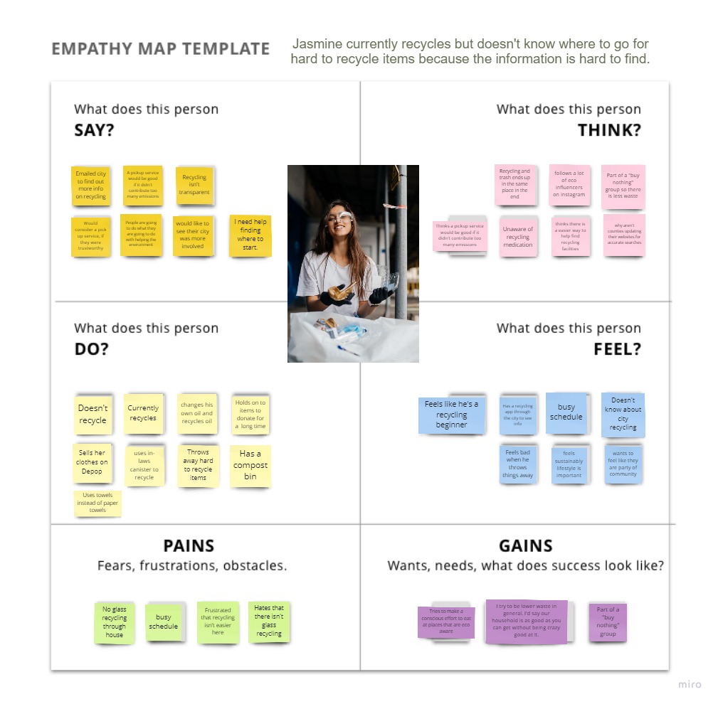
Our user is a young woman in her early 20’s. She is wanting to engage in a low waste lifestyle. Her goals are to shorten her google searches and to know where to take hard-to-recycle items in her area.
Our team used an empathy map based on our research findings to construct this persona.![]()
Our team used an empathy map based on our research findings to construct this persona.

User Journey
After defining our persona, we sketched out a storyboard and user scenario to see how this person would engage with our app.
We then created a user flow and started deciding what our app needed.
We then created a user flow and started deciding what our app needed.

Prototype
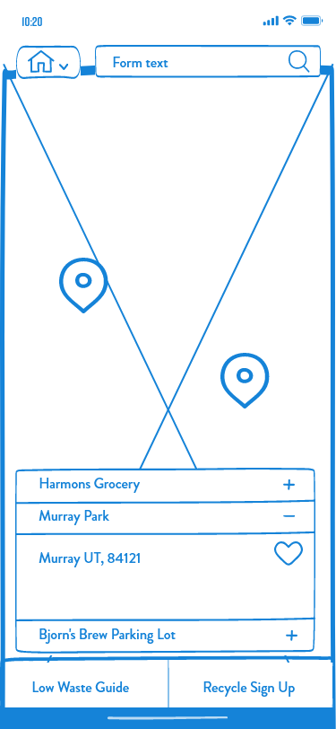
We started with sketched wireframes and then moved to low-fi digital wireframes.
Turning the wireframes into a prototype, we conducted user tests to see if the flow was intuitive.
We then iterated to make a clickable mid fidelity app, integrating a brand style guide.
Turning the wireframes into a prototype, we conducted user tests to see if the flow was intuitive.
We then iterated to make a clickable mid fidelity app, integrating a brand style guide.


Test
The feedback from testing allowed us to iterate again on our prototype. The top five changes we made to enhance the user experience were:
1. Correcting the fonts for iOS to providing that familiar consistency.
2. Including options for both returning and new users.
3. Created a page specifically for our app features.
4. Used the app features page rather than the map as a home screen.
5. Created a payment verification page so that our users are confident knowing that we are keeping their information safe and confidential.
