GLOSSIER
UX DESIGNAs a design challenge, I decided to find a page on a brand’s website that could use some serious TLC. I decided to go with a brand I love, Glossier, and give the help page two different updated designs.
Challenge: Redesign site page
Role: Designer
Duration: 4 days
Tools: Photoshop, Figma
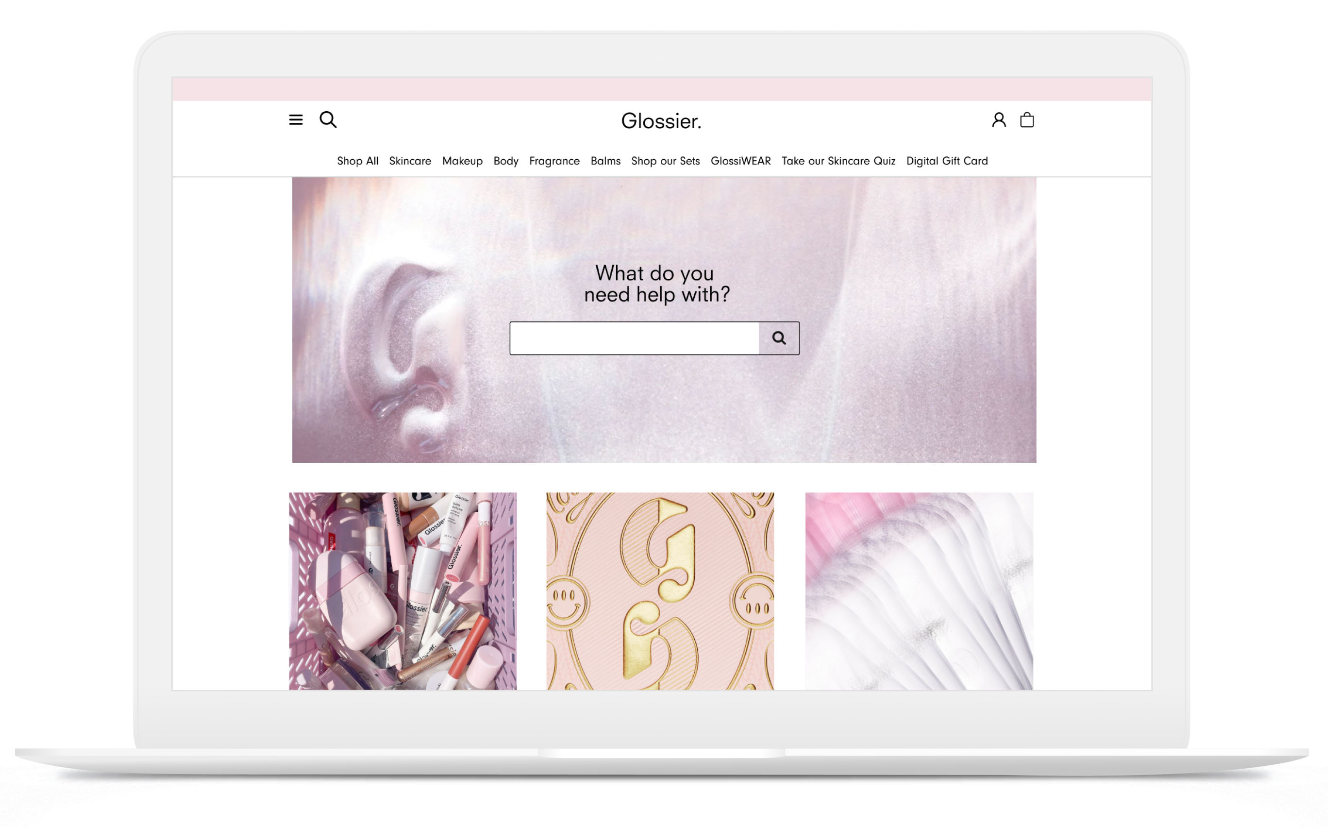
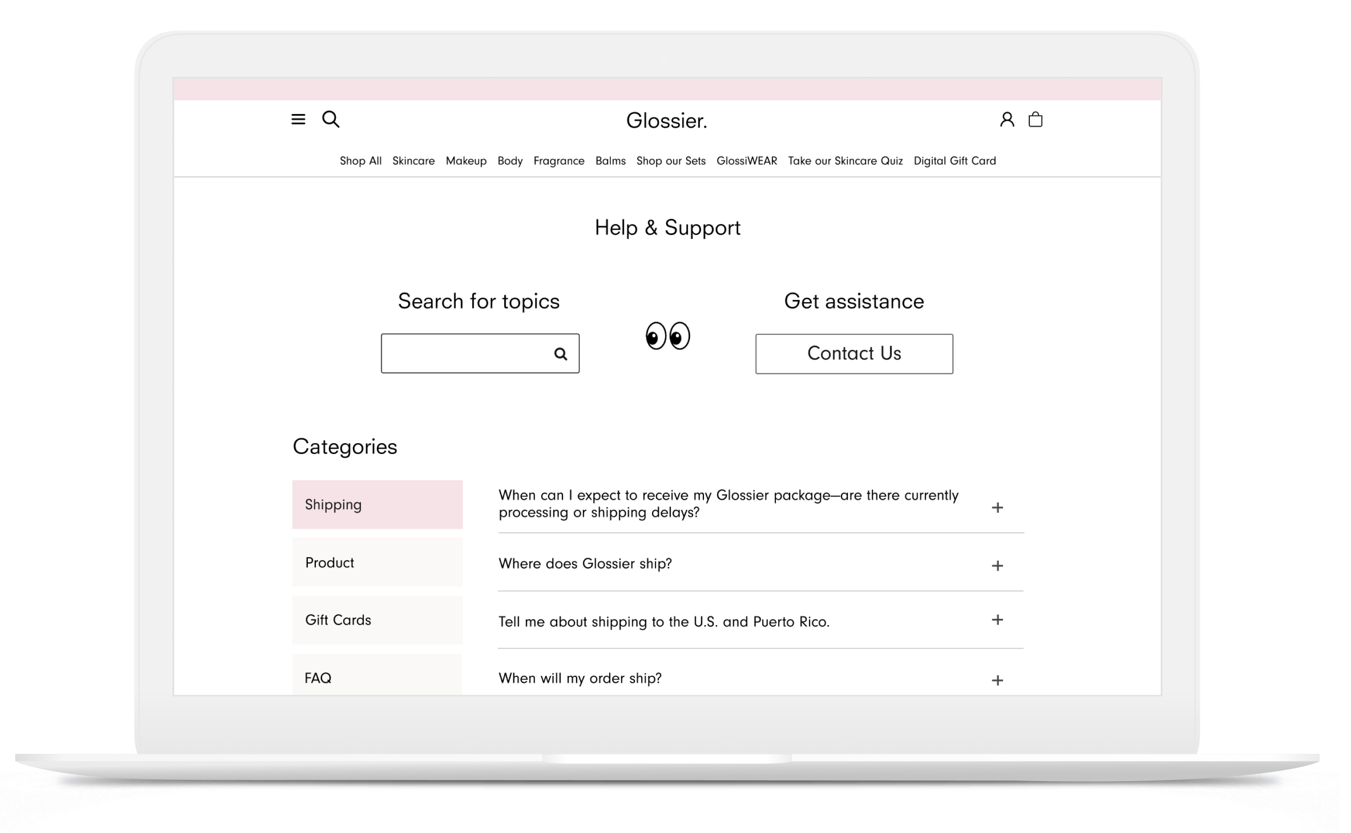
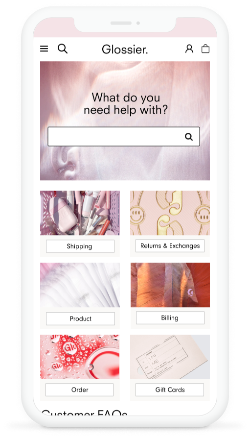
Current Design
• Design is monotonous
• No page-specific search option
• Visual hierarchy is hard to understand
• Dramatically different than rest of brand website
• Not optimized for mobile device
![]()
• No page-specific search option
• Visual hierarchy is hard to understand
• Dramatically different than rest of brand website
• Not optimized for mobile device

Problem Statement
Support pages are one of the last places a website visitor will look before deciding to give up and search for another website that will fulfill their requirements. Glossier users want to be able to find the help and support they are looking for easily so they will purchase or continue purchasing from the brand.
Goal
With the redesign, Glossier users will be able to easily find answers to their questions while still being visually engaged. These users will be less likely to become frustrated and exit or have a negative association with the brand.
Research and Findings
I interviewed and conducted usability tests with six people.
Their priorities for the Glossier search page were:
• Search bar to find exactly what they are looking for
• Separate categories for different searches
• Easy access to company contact information
The users pain points were:
• Too much scrolling
• Eye-straining designs
• Not finding what they need
Their priorities for the Glossier search page were:
• Search bar to find exactly what they are looking for
• Separate categories for different searches
• Easy access to company contact information
The users pain points were:
• Too much scrolling
• Eye-straining designs
• Not finding what they need
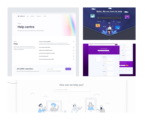
Mood Board
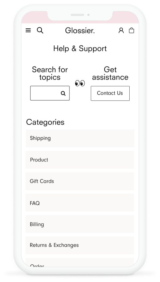
Mobile Versions
Assumptions v. Research
Assumptions: The Glossier help page is frustrating and boring to look at. This creates a drop-off point for current and potential customers.
Research needed: Page analytics. More users to interview. Usability testing to see if the new design is intuitive/user-friendly. A/B tests to see if my solutions are better than the original and to determine which one is a better design solution.
Research needed: Page analytics. More users to interview. Usability testing to see if the new design is intuitive/user-friendly. A/B tests to see if my solutions are better than the original and to determine which one is a better design solution.
Future Improvements
• Create expandable search bar in mobile so it is not crowded
• Remove eyeball gif if it tests as too distracting
• Add imagery to match the Glossier brand (maybe a header behind
the search and contact.)
• Create interactions e.g. hover colors, reaction gifs
• Chat options depending on staff labor power
• Remove eyeball gif if it tests as too distracting
• Add imagery to match the Glossier brand (maybe a header behind
the search and contact.)
• Create interactions e.g. hover colors, reaction gifs
• Chat options depending on staff labor power