OPSCOMPASS
UX DESIGNSince February 2022, I have been responsible for the entire UX process at Opscompass, a B2B company focusing on software asset management. In this role, I conduct user research, gather quantitative data, design wireframes and high-fidelity mockups, deliver designs to the developers, and collaborate with them to ship the product.

Collaborative Approach
As a UX Designer on an Engineering team, I work cross-functionaly throughout the product development lifecycle by:
- Partnering with product managers to align features with business goals
- Collaborating with engineers to ensure design feasibility and quality implementation
- Engaging with customers to validate solutions meet their needs
Research
Research methods I use at Opscompass include:
- User interviews with customers to uncover pain points and validate solutions
- Card sorting exercises to improve information architecture and navigation
- Unmoderated testing to understand usability issues
- Concept testing to validate ideas before development
- Data analysis leveraging Google Analytics to identify usage patterns
- Customer feedback collection to prioritize improvements
Design
My design workflow emphasizes collaboration and iteration:
- Begin with mid-fidelity prototypes using our design system components
- Gather stakeholder feedback and iterate on concepts
- Develop high-fidelity prototypes for engineering review
- Refine designs based on technical considerations
- Create comprehensive design handoffs including user flows, interaction details, and implementation notes
Key Achievements
- Designed six new product features and refreshed nearly every page of our web application in my first year
-
Led a comprehensive UX audit in 2023, resulting in redesigns that reduced customer bounce rate by 25%
-
Streamlined development handoffs through detailed documentation, reducing implementation questions and revisions
- Built a design system with reusable components for product consistency
- Established standardized user research methods to inform product decisions
Case Study
Problem
OpsCompass customers were skipping our database configuration UI entirely and using the CLI instead.
Adding database connections required entering each one individually. For a customer like The Hartford, who have hundreds of connections, it was arduous. Once you have hundreds of connections set up, the card-based UI made it nearly impossible to find or manage what you already had. There was no search, no filtering, and cards don't scale.
Approach
I didn't have access to watch customers use the product directly since they work through consultants, so I went to the consultants. I talked with them to understand where the friction was and what workarounds they'd developed.
I also did research on how other enterprise tools handle large-scale configuration and bulk data entry and validated the direction I was already leaning.
I explored a list view and an accordion-style layout first. Both had the same problem: they required editing one connection at a time. That didn't work for bulk editing, and it wouldn't scale for a customer like The Hartford.
Solution
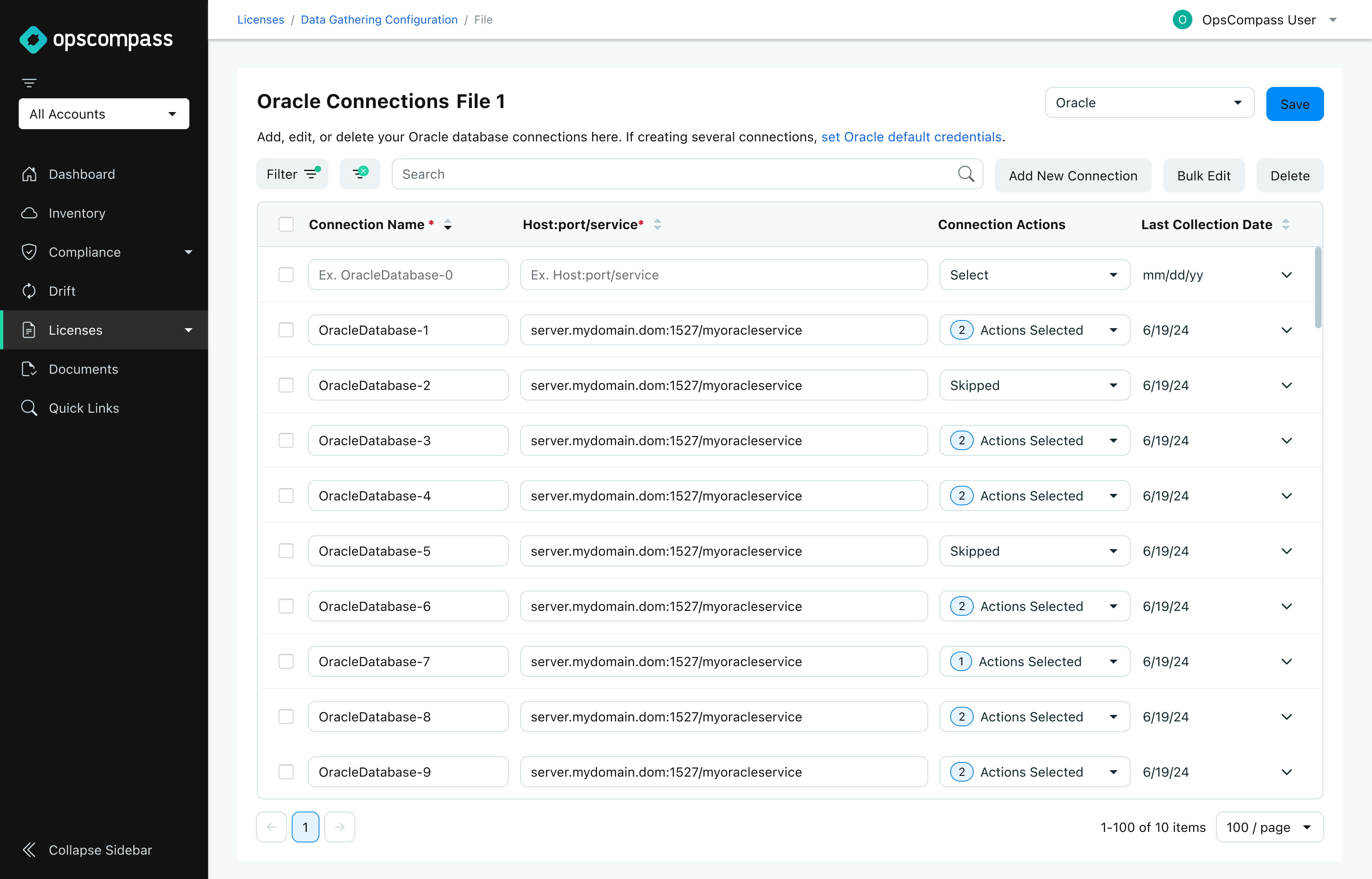
The table layout addressed both. It's a familiar pattern in our product, supports scanning large datasets, and gives users a natural place to select and act on multiple items at once.
Bulk operations came from a combination of what consultants described and my own understanding of the problem. Users needed to be able to add, edit, duplicate, and delete multiple connections at once. When you're managing hundreds of connections, acting on groups isn't optional.
Search and filtering was also essential for finding relevant connections to edit.
Result
The consultants who work directly with those customers told me the new interface addressed the exact problems they'd raised. Opscompass has a small customer base that relies heavily on consultants, which creates a buffer between users and the product that makes adoption data hard to track.
If I could go back, I'd push harder for unmoderated testing with an end user. Consultant feedback is valuable, but there’s nothing as essential as understanding the user experience of your product.
OpsCompass customers were skipping our database configuration UI entirely and using the CLI instead.
Adding database connections required entering each one individually. For a customer like The Hartford, who have hundreds of connections, it was arduous. Once you have hundreds of connections set up, the card-based UI made it nearly impossible to find or manage what you already had. There was no search, no filtering, and cards don't scale.
Approach
I didn't have access to watch customers use the product directly since they work through consultants, so I went to the consultants. I talked with them to understand where the friction was and what workarounds they'd developed.
I also did research on how other enterprise tools handle large-scale configuration and bulk data entry and validated the direction I was already leaning.
I explored a list view and an accordion-style layout first. Both had the same problem: they required editing one connection at a time. That didn't work for bulk editing, and it wouldn't scale for a customer like The Hartford.
Solution
The table layout addressed both. It's a familiar pattern in our product, supports scanning large datasets, and gives users a natural place to select and act on multiple items at once.
Bulk operations came from a combination of what consultants described and my own understanding of the problem. Users needed to be able to add, edit, duplicate, and delete multiple connections at once. When you're managing hundreds of connections, acting on groups isn't optional.
Search and filtering was also essential for finding relevant connections to edit.
Result
The consultants who work directly with those customers told me the new interface addressed the exact problems they'd raised. Opscompass has a small customer base that relies heavily on consultants, which creates a buffer between users and the product that makes adoption data hard to track.
If I could go back, I'd push harder for unmoderated testing with an end user. Consultant feedback is valuable, but there’s nothing as essential as understanding the user experience of your product.
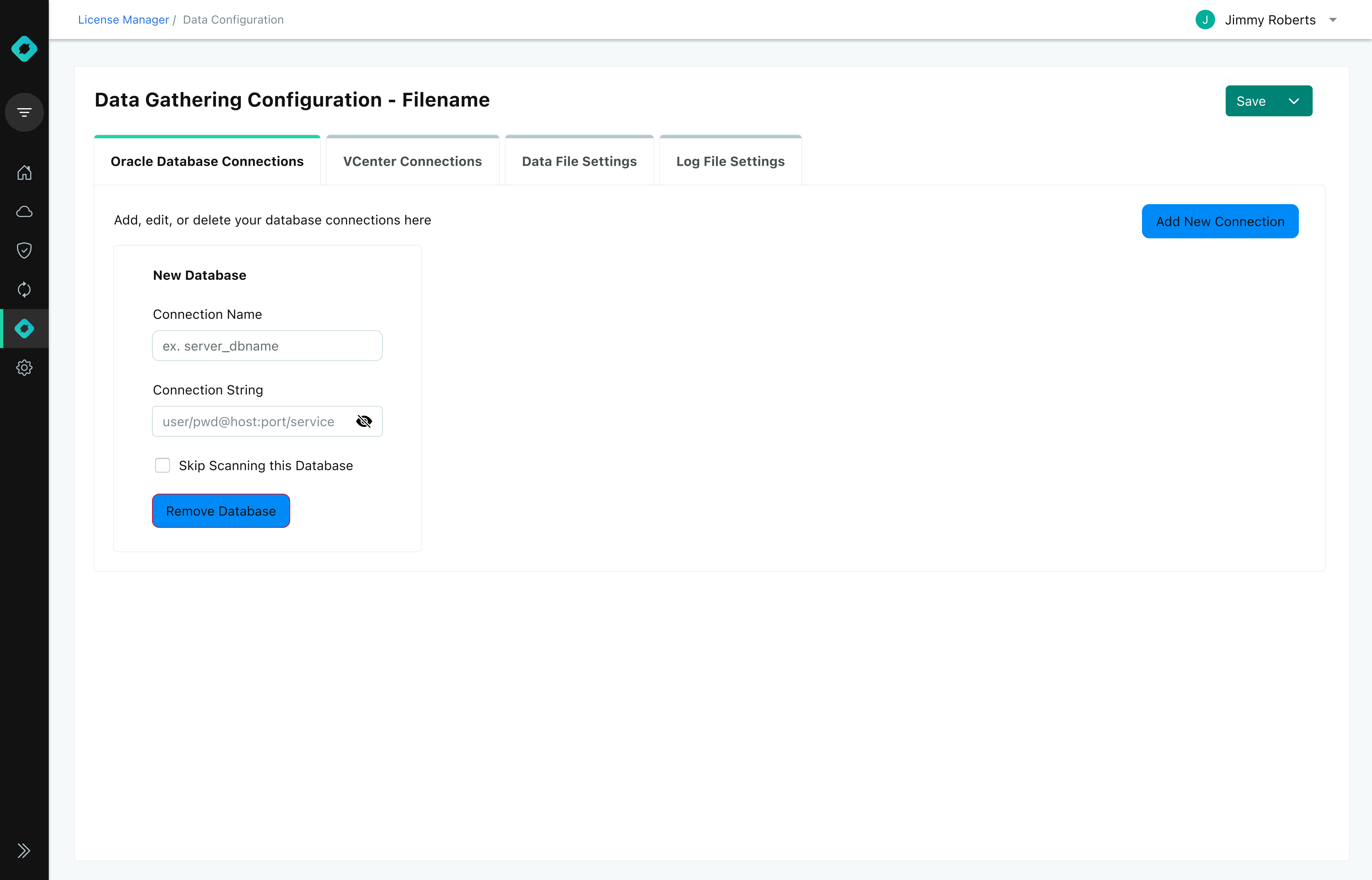
Old Design
New Design
Accessibility
Before joining the company, accessibility was not prioritized in the design and development process. I took the initiative to transform our view of digital accessibility:
Comprehensive Accessibility Audit
Team Education & Advocacy
Comprehensive Accessibility Audit
- Conducted the company's first thorough accessibility evaluation
- Identified 30+ specific improvement opportunities
- Implemented changes that increased WCAG 2.1 compliance score by 21%
Team Education & Advocacy
- Organized and led an Accessibility Lunch and Learn session for product development teams
- Created accessible design principles documentation
- Added detailed accessibility annotations to design handoff materials
- Advocated for accessibility considerations in product roadmap discussions
