READY, GO
UX DESIGNFor my first UX challenge, I created the mobile application Ready, Go to simplify coordinating trips with other people.
Challenge: Create a travel mobile app
Role: UX Researcher + Product Designer
Duration: 3 weeks
Tools:
Miro, Figma, Invision, FlowMapp, Adobe XD
Research
With the end of the pandemic near, many friends spread across the country want to finally come together for vacations.
To gather initial insights, I conducted five one-on-one structured user interviews via Zoom.
Key Insight:
Balancing people’s needs, expectations, commitments, and schedules are the biggest pain points when group traveling.
Key Insight:
Balancing people’s needs, expectations, commitments, and schedules are the biggest pain points when group traveling.
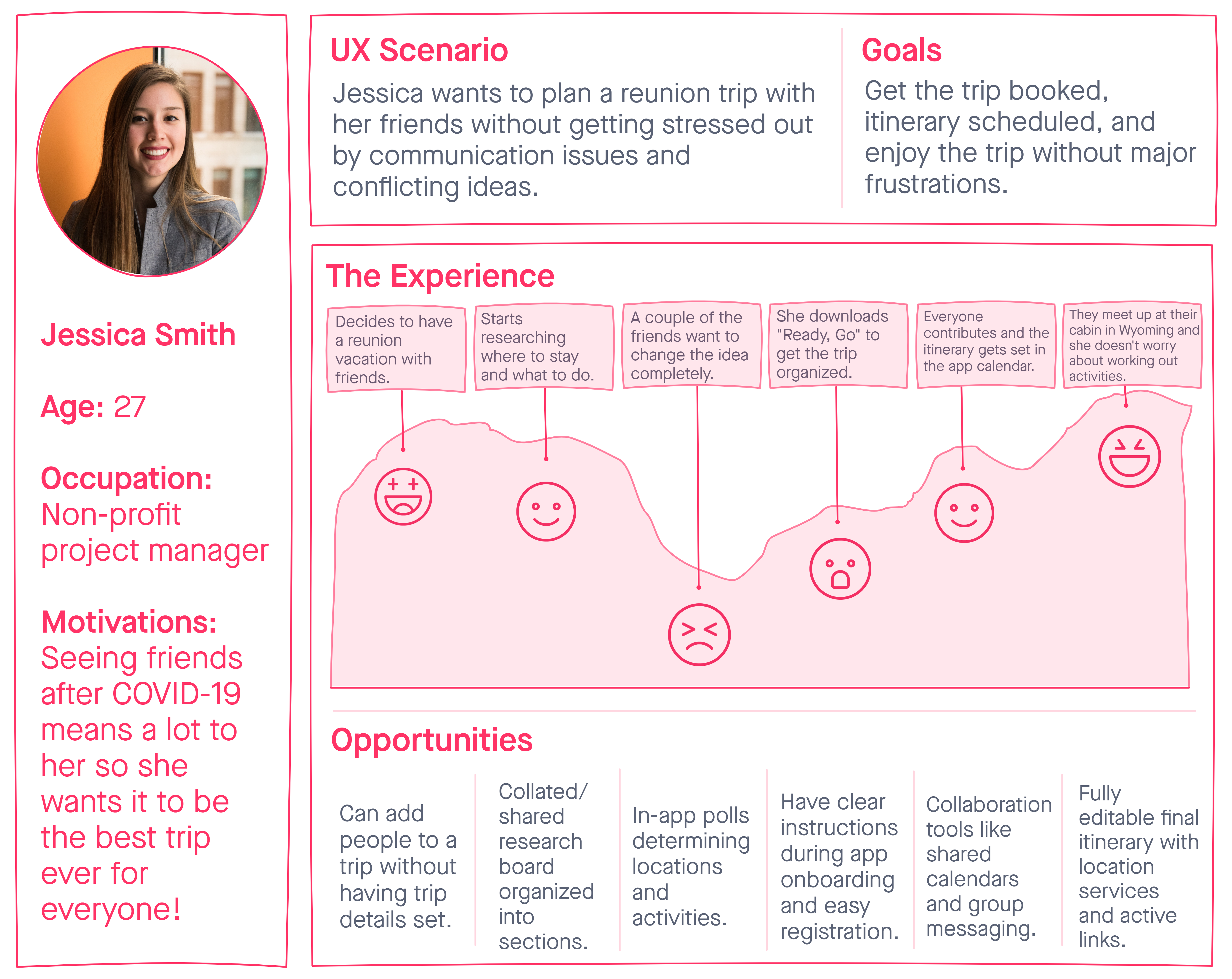
Persona
After analyzing the user insights, I defined a user persona. The target user, Jessica, has the problem that she feels overwhelmed and anxious when planning a trip with other people. How might we create a way for her to feel more relaxed and flexible during the trip planning process?
![]()

User Journey
To illustrate how Jessica would use the app, I created a UX scenario, storyboard, and value proposition statement. I wanted to try many methods to see what worked best for this product.
![]()
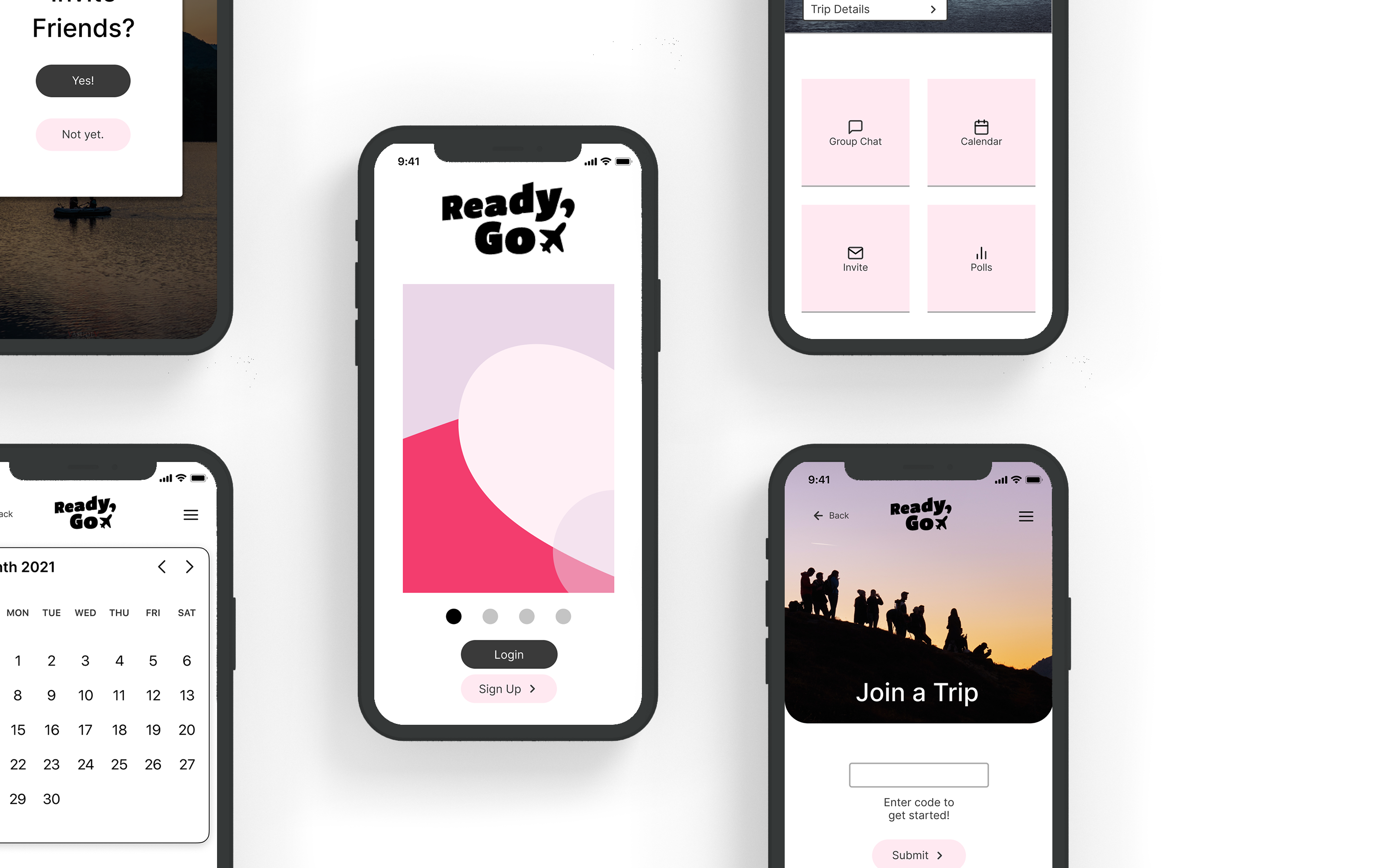
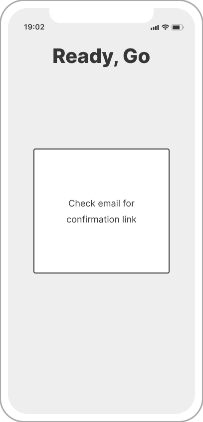
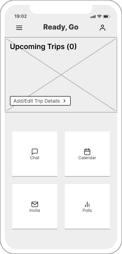
Prototype
I created three iterations of the app. I started with paper and moved to low fidelity.
The first set of usability testing took place after this step.
I then iterated and created a mid/high fidelity prototype (featured in the image at the top of the page).
The first set of usability testing took place after this step.
I then iterated and created a mid/high fidelity prototype (featured in the image at the top of the page).


Test
To test my prototype’s usability, I conducted five one-on-one guerilla user tests via Zoom.
Two of the users who tested my prototype were front-end software developers.
Based on their familiarity with UX/UI they recommended:
Two of the users who tested my prototype were front-end software developers.
Based on their familiarity with UX/UI they recommended:
- Back buttons everywhere
- Removing the profile button if it’s not an app where the profile matters
- Make the hamburger menu show all the functionality of the app
- Change the join/create trip process if you are a returning user