ROTTEN POTATOES
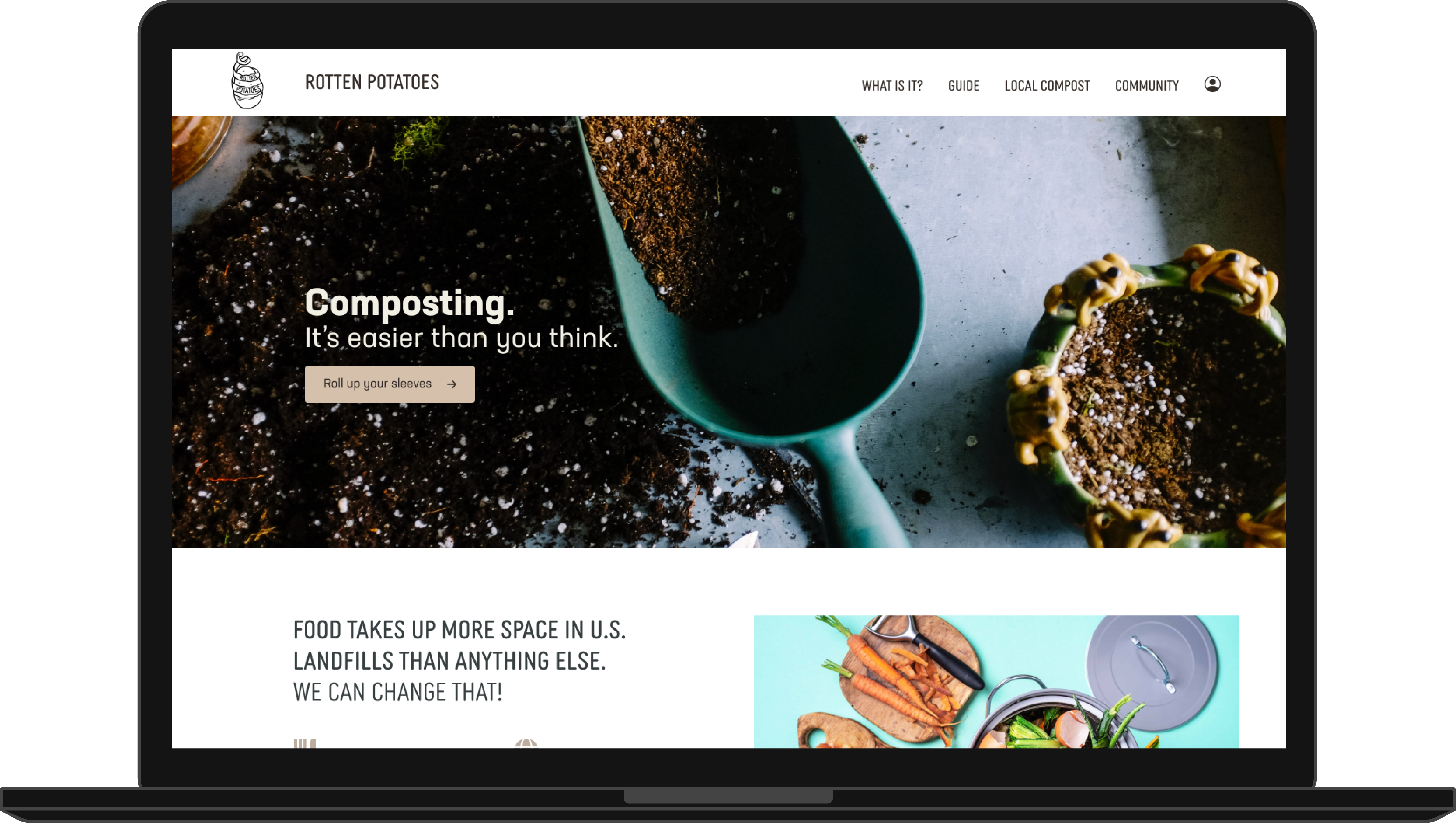
UX DESIGNMy team was tasked to pick a global cause and create an informational website for it. We picked composting. Our site, Rotten Potatoes, attempted to reduce the stigma that composting is complicated or intimidating.

Challenge: Research, design, + code website
Role: Prototyping and front-end design
Duration: 3 weeks
Tools: Figma, Miro, Photoshop, HTML, CSS, JavaScript
Research
After deciding our product topic, we conducted a competitive analysis, sent out a survey that received 20+ responses, and conducted five virtual user interviews.
We sorted through our quantitative and qualitative data to define user needs and then refine our user persona.
We sorted through our quantitative and qualitative data to define user needs and then refine our user persona.
User Journey
Looking through the data again, we created an affinity diagram, user persona, and journey map.
Defining our user and our user’s problem statement guided our next steps. I developed the user scenario to present the thought process of our user.
Defining our user and our user’s problem statement guided our next steps. I developed the user scenario to present the thought process of our user.

Style Guide
We were able to flesh out the storyboard and user and create our style guide to begin our website design.

Prototype
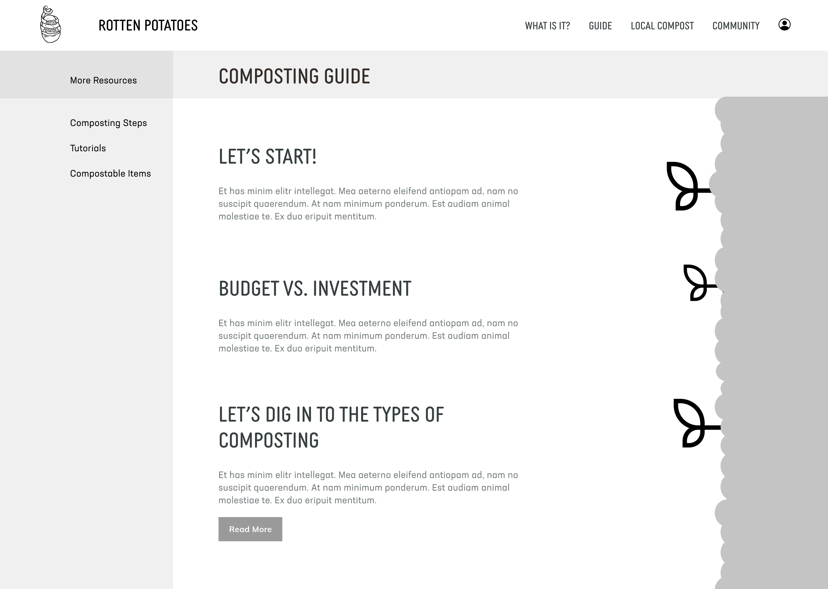
To begin prototyping, we took two of our paper wireframe ideas and then started wireframing in Figma.
We created one low-fidelity prototype and then conducted testing through our mid and high-fidelity prototypes to continue iteration.
We created one low-fidelity prototype and then conducted testing through our mid and high-fidelity prototypes to continue iteration.

Test
After each prototype was developed we conducted usability tests to gain input. We had 3 of our 5 mid-fidelity testers mention that the “impact” page was overwhelming. This was a great learning experience and reinforced the importance of listening to the user.
We conducted an A/B test to see if the same information presented differently would change their minds. Test B was overwhelmingly more successful than our previous design.
We conducted an A/B test to see if the same information presented differently would change their minds. Test B was overwhelmingly more successful than our previous design.
Web Dev
For this project, I developed our prototype using CSS, HTML5, Bootstrap 5, and jQuery.
