UTAH OPEN LANDS
UX DESIGNMy team was tasked to redesign a local non-profit’s website. We redesigned pages of the Utah Open Lands website to help drive traffic, ideally resulting in more donations and volunteers.
Challenge: Redesign non-profit website
Role: Project Manager, Prototyping Lead
Duration: 3 weeks
Tools: Adobe XD, Miro, Photoshop
Research
In order to determine our target audience and how we could improve the website, we had to conduct research.
Our team created a survey (28 responses), conducted five user interviews, stakeholder interviews, competitor analysis, and heuristic evaluations.
Our team created a survey (28 responses), conducted five user interviews, stakeholder interviews, competitor analysis, and heuristic evaluations.
Persona
After analyzing the user research data, we defined a user persona. Savannah is your typical Utah granola girl that wants to donate time and money to an organization she believes in. She is an outdoor enthusiast and wants to protect the lands she enjoys.
Ideate
We then sketched out a storyboard and user scenario to see how our persona would engage with the site.
We then revised the information architecture of the site to streamline the process for donors and volunteers.
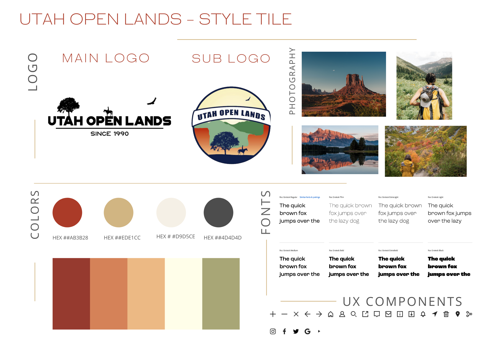
This is also the step where we developed a visual style guide for the new site.
We then revised the information architecture of the site to streamline the process for donors and volunteers.
This is also the step where we developed a visual style guide for the new site.

Prototype
We created three iterations of our prototype, and conducted moderated user testing after each iteration.
We started with sketches, then wireframes, and finally the high fidelity clickable prototype, implementing the style guide we created.
We started with sketches, then wireframes, and finally the high fidelity clickable prototype, implementing the style guide we created.

Test
After developing the iterations and testing those, we gathered and synthesized the feedback to make final changes.
We moved and altered the “Give” link to make it more prominent, we ditched the secondary menu on the left, and we conducted A/B tests to determine the timing of a donation pop-up.
We moved and altered the “Give” link to make it more prominent, we ditched the secondary menu on the left, and we conducted A/B tests to determine the timing of a donation pop-up.